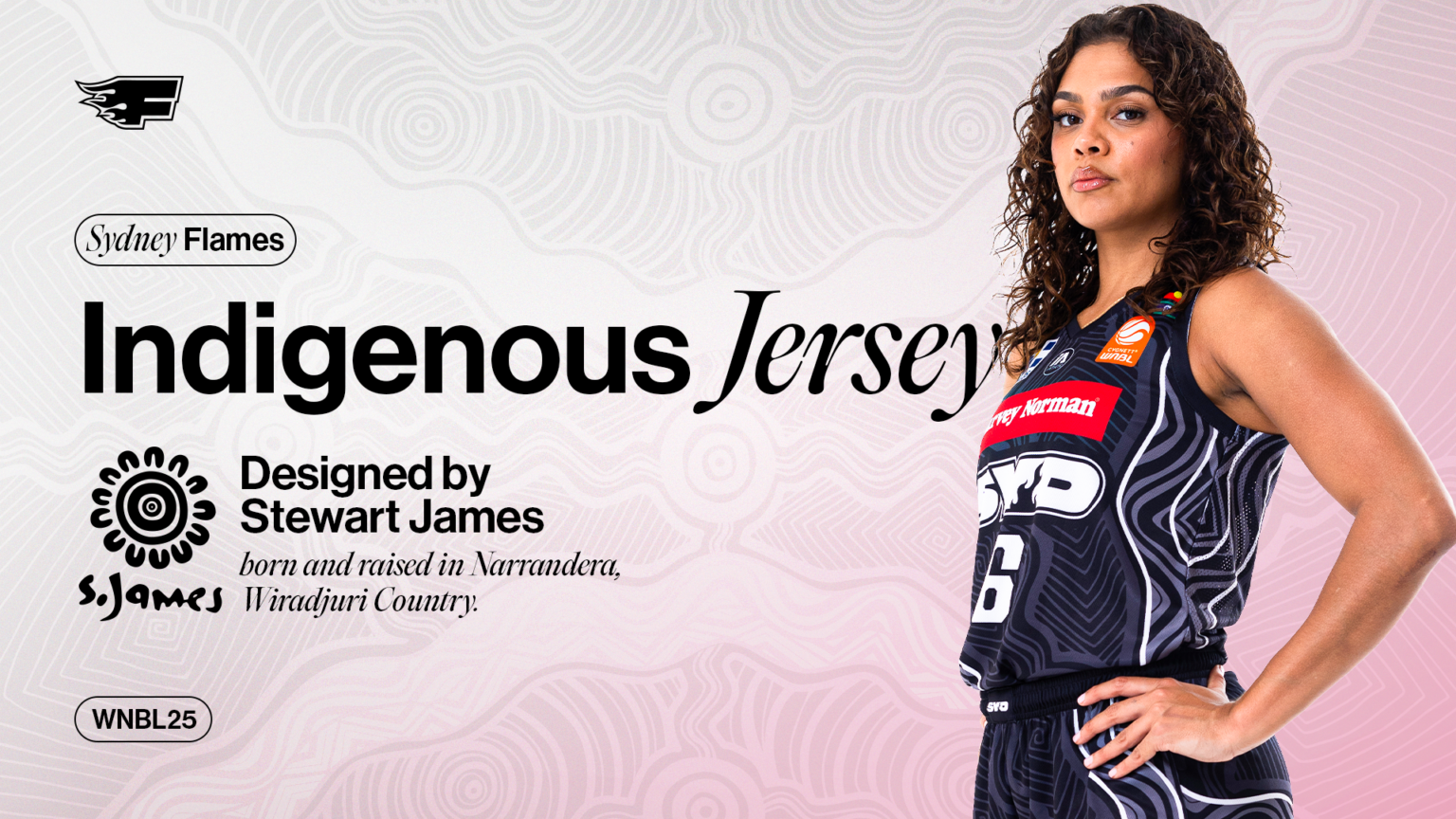
The Sydney Flames are thrilled to unveil their specially designed uniforms for the WNBL's 2024-25 Indigenous Round.
For the fourth year running, the uniforms are once again designed by Stewart James, born and raised in Narrandera, Wiradjuri Country.
"It goes without saying, that it is a privilege to design both Sydney Kings and Sydney Flames Indigenous Round jerseys," James said.
"I treat every opportunity as if it's my first and my last."
PURCHASE YOUR FLAMES QUAYCENTRE TICKETS HERE
The basis of this season's design, similarity to the Kings, is all about identity, as James stated 'to go forward in life, you must know who you are and where you come from'.
"[Identity] includes the stories that have built the foundations of who the Sydney Flames are as a club, how they represent the people and the areas across Sydney, and the proud history and culture of all that has come before them," James said.
This particular design embraces the stories that have built the foundations of who the Sydney Flames and Hoops Capital club are.
They represent the people, the areas across Sydney, and the proud history of all that has come before them.
Throughout the design (as shown on the graphic), there are symbols that hold important meaning and are intentionally designed in a way that explains the geographical connection between all the areas across Sydney.
There are five meeting places the symbols acknowledge, including the ancestral lands and waters of all the First Nations clan groups that cover the entire footprint of the Sydney area.
Leading outwards from these symbols are swirling lines that connect to the entire design, which demonstrates the link to the old stories and the new stories.
Still to this day, those areas carry a proud history and connection to those places and those peoples.
Further to that, the same five symbols acknowledge the success of the Kings, by including the five NBL championships they have previously won, which embraces another level of identity to who they are.
The diamond patterns represent a protective armour-like feature of the design.
This pattern was often used on traditional weaponry in various regions throughout First Nations groups, particularly seen on traditional shields used for combat.
The continuous circular patterns reflect the diverse cultures that Sydney embraces as a place.
SECURE YOUR WNBL25 MEMBERSHIPS NOW
These same circular patterns recognise all the knowledge and history that is included within this design and allow people from all walks of life, from all areas of Sydney, to stand united when the Sydney Flames take the court.
The main difference between the Flames and Kings this season is the colour scheme, with this campaign's design being predominantly black with white trims - compared to the purple, gold and white of the Kings.
"I love that the design has the ability to adapt to separate colour combinations," James said.
"Same design, same meaning but different styles, and that gives the Flames a unique point of difference, and to me that's what makes this design even more special."
The Flames will wear these uniforms during their road round four fixtures against Adelaide (Wednesday, November 20) and Perth (Saturday, November 23).